Over the next month I will try to be more informative about my painting technique (just in case someone might be able to learn something). The below post is a list of my tools, and then in the near future, I will also document a painting so everyone can see the steps and amount of time it takes to create a "studio" painting.
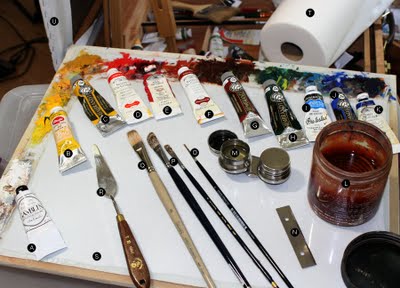
Oil Paints:
A. Gamblin Titanium Zinc White (this is a great white that has a great blend of opaqueness and transparency) - If I'm not using this, I also revert to just Zinc white
B. Cadmium Yellow Light - I'm trying out the Utrecht brand because of price and it is fairly close to the Winsor Newton that I usually use
C. Yellow Ochre Light - Rembrandt (Rembrandt paints have a great consistency out of the tube, but after a few hours, they tend to get "plasticy", so I only put a little on my palette at a time to keep the paint fresh)
D. Cadmium Red - Winsor Newton (Best brand of paint in my opinion, so I try to stick with it for the reds, but it is much more expensive than the others)
E. Alizarin Crimson - I like both the Winsor Newton and Gamblin brands
F. Terra Rosa - I rarely use this color, but there are key times when mixing flesh tones that it is the purest way to get a reddish hue to the checks and nose
G. Transparent Oxide Red - I used to use Burnt Sienna, but this color is far more transparent which is always something I'm looking for. This is without a doubt the color I go through the most--it seems to find it's way in almost all color mixtures.
H. Viridian - The green. You can usually get any green from this . . . it is on the blue side, so I add a lot of yellow when painting grass and trees.
I. Cerulean Blue - This is one of those colors that are not necessary, but it is always so close to the color of the sky when landscape painting, and it "kills" a flesh color so well, that I keep it on my palette so I don't have to mix it every time.
J. Cobalt Blue light - I don't use this much, but it is a very pure blue and is helpful when I don't want something to get to purple.
K. Ultramarine Deep - My second most used color. All warm and cool blacks usually start with this as the base, and this is used to create a lot of my greys.
Other Paints: I use a variety of yellows depending on the situation, in addition to the two above I also use Lemon yellow, cad yellow medium, and Yellow ochre medium. Sap green is the only other color that is not on my studio palette but I bring it with me when landscape painting. It is much closer to most foliage and I do a lot less mixing when I bring it along.
Tools:
L. Silicoil - (has a little spring coil inside that is more gentle to the brush hairs than a mesh brush cleaner) - usually filled with art grade mineral spirits (and sometimes turpentine - I don't really care which)
M. Medium in Palette cup - Schmid mixture: 1 part stand oil, 1 part damar, and 5 part mineral spirits. I use this to initially thin down my paints. It adds a very "liquid" feel to a painting and stops any "chalking" of the more opaque colors. Once I add it to a paint mixture, the mineral spirits evaporate fairly quickly, so if I go back to it, I generally dip my brush in the mineral spirits to get it back to the consistency I like (which is fairly thin, slightly thiner than softened butter - more like elmers glue)
N. 3.5-4" blade - For cleaning off the palette and for creating fine lines in a painting (I found it works much better than a palette knife, it is stiffer and you can place it just the way you want)
O. Sable Rounds - Various brands (you get what you pay for) ranging in sizes from 2-8
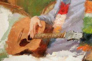
P. Langnickel 5590 - Sizes 6-30 (they must have their own sizes because normally a 30 would probably be gigantic, but it is comparable to a 10 flat in the Signets below) - the brushes of choice for most of the major painters today (Schmid, Lipking, Baugh, Burdick, Gerhartz . . .) An absolutely great brush that creates beautiful strokes and effects. The hairs are very light, so they take some getting used to.
Q. Robert Simmons Signets - Flats 6-12 - I use these for all the block-ins and when I want a very transparent, brushy look
R. Palette Knives - the cheaper of the Italian brands, but they have held up for the last five years. I have a size 6 and 10
S. My Palette - Tempered glass glued to a light-grey spray painted masonite board. 16x20 (I also have a plein air setup with a home-made guerilla type box. Maybe I will show that some time in the future)
T. Paper Towels - Viva towels from Kleenex - not just because Schmid uses them, but because they really are the best for painting.
U. Claessens Oil Primed linen - From Utrecht, either 820 or 13J. Mounted onto Gatorfoam for plein air and small paintings, stretched over bars for larger studio paintings.
Ok, that's pretty much it. I do have some cheap, really large brushes from the painting section of home depot for those really large block-ins, and I have a bunch of miscellaneous tools like canvas pliers and such, but I assume everyone has stuff like that. Stay tuned for more over the next couple weeks.
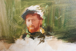
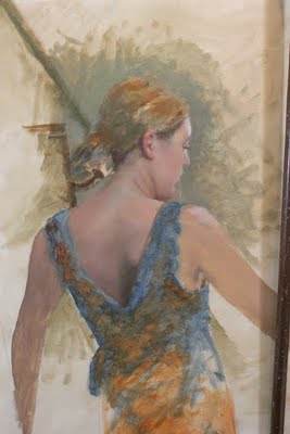
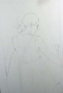
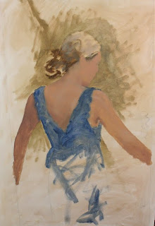
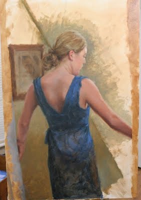 At this stage, I warmed up the skin tones on the back and the left arm (mostly in the darks). Although my reference photos seemed to be producing that almost purple tone, the colors were looking a little muddy and out of the norm (remember, nobody is ever going to see the reference photos, just the painting). I also started with the hand and a little more dabbling in the background.
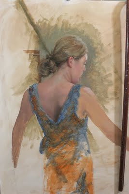
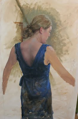
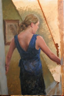 Not much to be said here, just working my way out . . . trying to be "brushy" and soft edged.
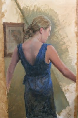
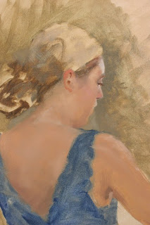
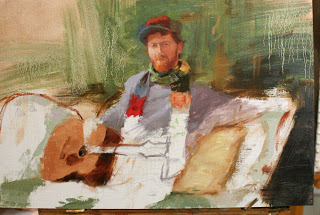
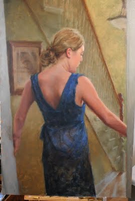 Apprehension, 24 x36 - Here is the the "final" painting. If I make any major changes, I'll post an update, and if you see something that looks off, or needs fixing, let me know.
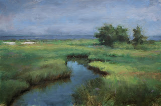